CSSplayにて紹介されていた、CSSのみで構成されているドロップダウンメニュー
「A Dropdown Menu with CSS3 enhancements」のご紹介。
≫Stu Nicholls | CSSplay | Professional CSS3 Drop All menu
CSSのみでの構成なのでアニメーションのような演出はありませんが
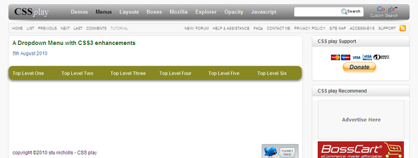
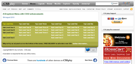
ドロップダウンは、親メニューにマウスオーバーで、そいつに付随する子メニューリストを表示する、というのが主流ですが、
「A Dropdown Menu with CSS3 enhancements」は一つの親メニューにマウスオーバーで、
全ての親メニューに対しての子メニューリストを表示するというもの。
一つの親メニューにマウスオーバーすれば、そのサイトのリストがサイトマップのように見ることができるうえに、
そのまま自由にリスト内を辿ることができるので、こういった構成の方がユーザーには親切な気がします。
CSS3を使っている部分は角丸やドロップシャドウ部分のみで
実際の動作はCSS3が対応していないブラウザでもちゃんと動いています。
(IE6のみ、子メニューリストにマウスオーバーで親メニューボタンの反転が効いていない)
使用しているCSSソースは、上記ページのソースを開いて、
<head>タグ内に<style type=”text/css”>で記載されているCSSソースから
構成を確認することが出来ます。
CSSソースを抜き出してみると以下のような感じに。
<style type="text/css">
#pad {height:200px;}  /* for this demo only */
/* ================================================================
This copyright notice must be untouched at all times.

The original version of this stylesheet and the associated (x)html
is available at http://www.cssplay.co.uk/menus/css3-dropdown-all.html
Copyright (c) 2005-2010 Stu Nicholls. All rights reserved.
This stylesheet and the associated (x)html may be modified in any
way to fit your requirements.
=================================================================== */

ul.top-ul {padding:0; margin:0; list-style:none; width:750px; font:normal bold 12px arial,sans-serif; position:relative; z-index:100;}
ul.top-ul li.top-li {position:absolute; float:left; width:748px; height:35px; overflow:hidden; background:#882;
-webkit-box-shadow: 0px 3px 8px rgba(0, 0, 0, 0.6);
-moz-box-shadow:0px 3px 8px rgba(0, 0, 0, 0.6);
-o-box-shadow: 0px 3px 8px rgba(0, 0, 0, 0.6);
box-shadow: 0px 3px 8px rgba(0, 0, 0, 0.6);

-webkit-border-radius: 10px;
-webkit-border-radius: 10px;
-moz-border-radius: 10px;
-o-border-radius: 10px;
border-radius: 10px;

-webkit-transition: all 0.5s ease-in-out;
-moz-transition: all 0.5s ease-in-out;
-o-transition: all 0.5s ease-in-out;
transition: all 0.5s ease-in-out;
}
ul.top-ul li a {text-decoration:none; color:#000;}
ul.top-ul li.top-li div {position:absolute; left:0; top:35px; width:750px; height:0; background:#bb5; border:1px solid #eee; border-width:1px 0;

-webkit-transition: all 0.5s ease-in-out;
-moz-transition: all 0.5s ease-in-out;
-o-transition: all 0.5s ease-in-out;
transition: all 0.5s ease-in-out;
}
ul.top-ul li.top-li div p {position:absolute; left:0; bottom:0; width:730px; padding:5px 10px; background:#aa4; opacity:0; filter: alpha(opacity=0);
 margin:0;
-webkit-transition: all 0.5s ease-in-out;
-moz-transition: all 0.5s ease-in-out;
-o-transition: all 0.5s ease-in-out;
transition: all 0.5s ease-in-out;
}
ul.top-ul li.top-li div p a {color:#fff;}
ul.top-ul ul {padding:0; margin:0; list-style:none;}
ul.top-ul ul ul {position:absolute;}

ul.main-ul {position:absolute; z-index:100; left:0; top:-35px;}
ul.main-ul li {float:left; position:relative; width:125px;}
ul.main-ul li a {display:block; height:35px; line-height:35px; text-decoration:none; color:#fff; padding-left:10px;}

ul.top-ul li.top-li:hover {height:200px;}
ul.top-ul li.top-li:hover div {height:150px;}
ul.top-ul li.top-li:hover div p {opacity:1; filter: alpha(opacity=100);}

ul.main-ul li:hover a {color:#000;}
ul.main-ul li a:hover {color:#ff0;}
ul.main-ul li:hover > a {color:#ff0;}

ul.main-ul li ul li {height:20px;}
ul.main-ul li ul li a {height:20px; line-height:20px;}

/* for IE6 */
* html ul.top-ul table {border-collapse:collapse; width:0; height:0; margin-bottom:-1px;}
* html ul.top-ul li.top-li {overflow:visible;}
* html ul.top-ul li.top-li a.top-a {display:block; position:relative; width:750px; height:35px; overflow:hidden; background:#882;}
* html ul.top-ul li.top-li a.top-a:hover {direction:ltr; height:200px;}
* html ul.top-ul li.top-li a.top-a:hover div {height:150px;}
* html ul.top-ul li.top-li a.top-a:hover div p {filter: alpha(opacity=100);}
</style>
ドロップダウンメニューの見せ方含めて、参考になります。
jQueryを使えば同じ動作でアニメーションをつけた演出も可能になりそう。
ご参考までに。。。